Posted by Mahdi
Chakra UI v2 vs v3: Migration Conflicts to Watch
Compare Chakra UI v2 and v3 migration conflicts, including provider setup, theming, color mode, compound components, icons, props, and testing.
If you are comparing Chakra UI two and Chakra UI three, the key point is this: Chakra UI v3 is not a drop-in upgrade from v2. It changes the provider setup, theme architecture, color mode approach, component composition model, icons, several package assumptions, and many component props.
That does not mean teams should avoid Chakra UI v3. It means the upgrade should be planned like a design system migration, not a routine dependency update. The official migration guide recommends starting with the codemod, but the codemod is only the first pass. Real projects still need manual review for custom components, wrappers, form controls, modals, Storybook, tests, theme tokens, color mode, and product-specific UI patterns.
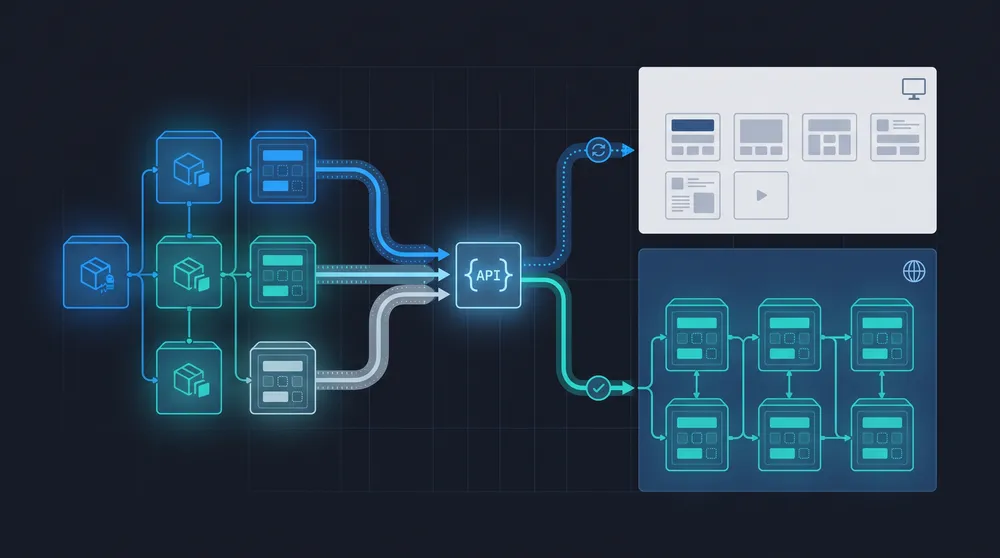
This guide explains the main conflict areas and gives a practical upgrade sequence. If your React app, SaaS product, CMS dashboard, or ecommerce admin needs migration support, VaniTech can help through CMS implementation, integration services, cloud architecture, and ongoing support.
Where Chakra UI v2 and v3 Usually Conflict
Most migration work comes from API shape changes, not from visual styling alone.
Provider Setup
v2 commonly wraps the app with ChakraProvider and a theme. v3 moves toward a system value and generated Provider snippet.
Theme Architecture
v2 theme extension patterns move to createSystem, defaultConfig, tokens, semantic tokens, recipes, and slot recipes in v3.
Color Mode
v3 relies on next-themes and CLI snippets for color mode rather than the same built-in v2 color mode API surface.
Compound Components
Several v3 components use Root, Trigger, Content, Control, Indicator, Track, Range, and similar subcomponents.
Prop Renames
Common v2 props such as isDisabled, isLoading, colorScheme, spacing, and onChange often need new v3 names.
Removed Packages
v3 removes or changes assumptions around @emotion/styled, framer-motion, @chakra-ui/icons, @chakra-ui/next-js, hooks, and Storybook addon usage.
Chakra UI v2 vs v3: Practical Comparison
The official v3 installation page lists Chakra UI 3.36.0 in the checked documentation and says the minimum Node.js version is 20.x. The v2 installation page shows Chakra UI v2.10.10 and says v2 is compatible with React 18. Those version numbers are useful context, but the migration decision should be based on the codebase, not only the package version.
| Area | Chakra UI v2 pattern | Chakra UI v3 pattern | Migration risk |
|---|---|---|---|
| Provider | Root app wraps with ChakraProvider, often with a theme prop. | System-based provider flow, often via generated Provider snippet and ChakraProvider value. | High if the app has custom providers, SSR, Storybook, tests, portals, or multiple app shells. |
| Theming | extendTheme, component style config, multi-style config, and familiar token objects. | createSystem, defaultConfig, defineConfig, tokens, semantic tokens, recipes, and slot recipes. | High for mature design systems with many custom variants and brand palettes. |
| Color mode | Built-in color mode helpers were common in application code. | v3 relies on next-themes, CLI snippets, and ClientOnly patterns for SSR-sensitive usage. | Medium to high for apps with dark mode, SSR, persisted theme preference, or visual tests. |
| Components | Many components exposed simpler single-component APIs. | Many v3 components use compound components and namespaced imports such as Dialog.Root or Progress.Root. | High for modals, forms, popovers, accordions, progress indicators, checkbox/radio groups, and custom wrappers. |
| Props | Common props include colorScheme, isDisabled, isLoading, spacing, leftIcon, rightIcon, and onChange patterns. | Common replacements include colorPalette, disabled, loading, gap, children-based icons, and onValueChange or onCheckedChange patterns. | Medium if the codemod covers most usage; high if wrappers hide these props. |
| Icons and packages | @chakra-ui/icons, @chakra-ui/next-js, framer-motion, @emotion/styled, and Chakra-specific helpers may be present. | v3 guidance removes or replaces several of these assumptions and recommends alternatives such as react-icons or lucide-react for icons. | Medium for ordinary apps; high for shared UI kits and package libraries. |
Before Upgrading to Chakra UI v3
Use this checklist before changing package versions in a production React app.
Audit Components
Find every Chakra import, wrapper component, form field, modal, drawer, popover, checkbox, radio group, and custom icon.
Map Theme Tokens
Convert brand colors, fonts, spacing, component variants, and semantic states into the v3 token and recipe model.
Test SSR
Check Next.js, Remix, Astro islands, hydration, color mode, portals, and ClientOnly boundaries before release.
Run Codemod
Use the official codemod as a first pass, then review each changed component manually.
Protect UX
Compare screenshots, keyboard behaviour, focus states, dialogs, forms, validation, and responsive layouts.
Plan Rollout
Upgrade in a branch, lock versions, run visual regression, and avoid mixing unfinished v2 and v3 patterns in production.
The Provider and Theme Conflict
The official v3 migration guide shows the provider changing from a v2-style ChakraProvider with a theme prop to a snippet-based Provider that composes ChakraProvider and color mode. It also says custom themes should move from extendTheme to createSystem and defaultConfig, with token values wrapped using a value key. The theming overview explains the v3 system around defineConfig, createSystem, ChakraProvider, tokens, semantic tokens, recipes, and slot recipes.
This is the area most likely to break a mature application. A small app may only need a new provider and token file. A product with a design system may need to rebuild component variants, brand colors, semantic tokens, global CSS, breakpoints, and recipe logic. If your team has a shared UI package, make the package migration first and consume it in one app before updating every product.
The Color Mode Conflict
Chakra UI v3 changes the color mode story. The migration guide says ColorModeProvider, useColorMode, LightMode, DarkMode, ColorModeScript, and useColorModeValue were removed from the core v3 API in favour of next-themes and snippets. The v3 color mode documentation says Chakra UI relies on next-themes and provides a color-mode snippet with hooks and components that feel similar to v2.
For SSR apps, this matters because color mode can create hydration mismatches. The v3 color mode docs recommend ClientOnly for components using color mode values in SSR contexts. Test this carefully in Next.js, Remix, and any app that server-renders a shell before client hydration.
The Component API Conflict
Chakra UI v3 leans heavily into compound components. The migration guide shows examples such as Modal becoming Dialog.Root with Dialog.Backdrop, Dialog.Positioner, Dialog.Content, Dialog.Header, Dialog.Body, Dialog.Footer, and Dialog.CloseTrigger. The Dialog documentation also shows the v3 usage model with Dialog.Root, Dialog.Trigger, Dialog.Backdrop, Dialog.Positioner, and Dialog.Content.
This is a good direction for explicit composition, but it affects code volume and wrapper design. If your v2 app has a custom AppModal, ConfirmDialog, FormField, Select, Checkbox, Radio, Drawer, Popover, or Progress wrapper, do not rely on codemod output alone. Rebuild those wrappers intentionally, write examples, and update tests around focus, escape key handling, click outside behaviour, validation messages, and accessibility.
Prop Changes That Cause Real Bugs
The obvious prop changes are easy to search for, but they still create bugs when they are hidden inside reusable components. The migration guide lists common changes such as colorScheme becoming colorPalette, isDisabled becoming disabled, isLoading becoming loading, Stack spacing becoming gap, Stack divider becoming separator, Button leftIcon and rightIcon moving to children, and Checkbox onChange becoming onCheckedChange.
These changes matter because they are not only syntax. Some event handlers now receive different payloads. Some components require hidden input subcomponents. Some props move from child components to Root components. Some visual states move to data attributes. That means a component can compile and still behave differently.
| v2 habit | v3 direction | What to test |
|---|---|---|
| colorScheme on buttons, badges, form controls, progress, checkbox, and radio. | Use colorPalette and define custom color palettes with tokens and semantic tokens. | Brand colours, contrast, focus ring, disabled state, dark mode, and hover states. |
| isDisabled, isInvalid, isReadOnly, isRequired, isLoading. | Use HTML-like disabled, invalid, readOnly, required, loading patterns where applicable. | Form submission, validation, screen reader states, disabled interactions, and loading indicators. |
| Modal, ModalOverlay, ModalContent, ModalHeader, ModalBody, ModalFooter. | Use Dialog compound components. | Focus trap, scroll locking, escape key, close buttons, overlay clicks, nested dialogs, and portal placement. |
| Stack spacing and divider. | Use gap and separator. | Responsive spacing, list separators, card layouts, and visual regression screenshots. |
| @chakra-ui/icons imports. | Use react-icons, lucide-react, or Chakra Icon wrapping. | Icon sizing, alignment, accessible labels, colour inheritance, and tree shaking. |
Recommended Migration Plan
- Create a migration branch. Freeze feature work that touches the shared UI layer during the upgrade.
- Inventory usage. Search imports, custom wrappers, theme files, Storybook stories, snapshots, tests, portals, forms, and color mode usage.
- Run the official codemod in dry mode. Review expected changes before writing to the branch.
- Upgrade packages deliberately. Confirm Node 20.x, React compatibility, framework support, lockfile changes, and package removals.
- Rebuild the provider and theme first. Get the app shell rendering before converting every feature component.
- Migrate shared wrappers next. Handle Button, Link, Field, Dialog, Drawer, Popover, Checkbox, Radio, Select, Toast, and icon wrappers centrally.
- Run visual and interaction tests. Test keyboard navigation, focus management, validation, dark mode, responsive layouts, Storybook, and screenshots.
- Ship in slices where possible. For large products, upgrade one app shell or UI package first, then roll the pattern through the wider product.
If the migration is part of a wider rebuild, pair it with frontend architecture work rather than treating it as isolated dependency maintenance. VaniTech can help plan this through technical architecture, support and maintenance, and website solution delivery.
Sources Checked
Chakra UI v2 to v3 Migration FAQs
Short answers for teams deciding whether to upgrade now or plan a staged migration.
Upgrade Your Frontend Without Breaking the Product
VaniTech can audit your Chakra UI v2 usage, plan the v3 migration, update shared components, test critical workflows, and support rollout across your React applications.